

It's available directly from your Livestorm account after a session ends, showing registrant, attendee, and engagement data for that event alongside your historical sessions.
Webinar Glossary
Webinar dashboard
A webinar dashboard is a central location for data and insights about a webinar.
What is a webinar dashboard?
Dashboards are digital interfaces that group and organize information. They are central locations for data and insights about a specific topic. In a webinar platform, the webinar dashboard gives an overview of information about a webinar.
What does a webinar dashboard actually show?
A typical webinar dashboard surfaces figures like the number of registrants, live attendees, no-shows, average watch time, and engagement activity (chat messages, poll responses, Q&A submissions), usually broken down per session and aggregated across a series.
For context on what “normal” looks like: across the 33,786 webinars analyzed in Livestorm’s 2026 Webinar Benchmark Report, the average session had 175 registrants, 83 live attendees (a 47.7% show-up rate), ran for 68 minutes with an average watch time of 26 minutes, and generated 20.4 Q&A questions and 2.77 polls. A dashboard’s real value is letting organizers compare their own numbers against benchmarks like these to spot whether a specific webinar under- or over-performed, and why.
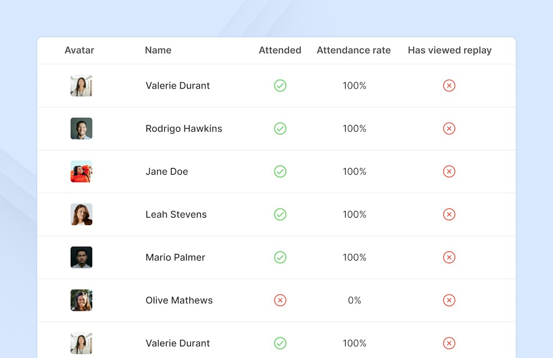
Details about attendees can be accessed here, like the number of registrants, live attendees, no-shows, and who watched the webinar replay. Engagement data is logged in the dashboard as well, letting organizers know more about any polls, questions, or messages.
Information about the number of sessions of a webinar is also included in the dashboard. Organizers can know at a glance when the webinar was created and how long it lasted. To access a webinar dashboard a webinar first needs to be published.
Benefits of webinar dashboards
Webinar dashboards make data transparent, save time, and improve decision making.
With a webinar dashboard, organizers have direct access to data. They can monitor if metrics are being met and easily build reports with the information they find. It is also easier to analyze data when it is all grouped in one place. Quick insights can be gained from easy to understand visuals. And unbiased data can hold teams accountable to their KPIs.
Editorial & methodology — Written and reviewed by the Livestorm content team. Figures on this page are drawn from the Livestorm 2026 Webinar Benchmark Report (33,786 webinar sessions and 7M+ registrations analyzed). Last updated: July 2026.
Frequently Asked Questions
Where do you find your webinar dashboard in Livestorm?
Can you access a webinar dashboard in real time during a live session?
Yes. Most platforms show live stats, like current attendee count and chat activity, during the session, with a fuller report available afterward.
Can webinar dashboard data be exported?
Yes, typically as a CSV or through an integration or API, which is useful for feeding data into a CRM or spreadsheet.
Who on a team typically has access to the webinar dashboard?
Usually the organizer and marketing team, though access can extend to sales reps who want visibility into which of their leads attended.



Try Livestorm for free
Get started in minutes and run your first engaging webinar today.
- No credit card needed
- No installation required